How to Build a Competitor Watchlist for Mobile Apps | Appnalysis
Most watchlists track apps you already know. The ones that matter most are the ones you have never heard of.
Every product team with a mobile app has some version of a competitor watchlist. A handful of apps they check periodically. A Sensor Tower dashboard with a few names in it. An AppFollow alert that fires when one of their known rivals moves up the chart.
The problem is not the watchlist. The problem is who is on it.
Every app ranking tracker on the market (AppFollow, Sensor Tower, Similarweb, APPlyzer, AppStance, Appfigures and others) works the same way. You tell it which apps to watch. It watches them. What no app ranking tracker can do is tell you about the apps you have not thought to add yet.
The rival that is about to take your users is rarely the one on your watchlist. It is the one climbing from position 67 to position 34 in your category over the past 30 days, using the same technology stack as you, entering your primary territory from an adjacent market. By the time it appears in your top 10, you have already lost the early window.
This article covers how to build a watchlist that finds those apps, not just the ones you already know about.
What an App Ranking Tracker Does Well
Before dismissing existing tools, it is worth being clear about what an app ranking tracker genuinely does well.
Chart position tracking for known competitors is reliable and useful. Knowing that Revolut moved from position 3 to position 2 in UK finance this week, or that a direct competitor dropped out of the top 20, is actionable information. Keyword ranking tracking (seeing which search terms your competitors are gaining or losing ground on) is valuable for ASO. Review sentiment monitoring, feature change alerts and App Store metadata tracking are all legitimately useful inputs into a competitive intelligence workflow.
The gap is not that these tools are bad. The gap is that they are all reactive. They tell you what is happening with apps you already know about, not apps you do not know about yet.
That is a meaningful distinction in a category where app releases are up 80% year-on-year on iOS alone. New apps are entering every category faster than ever. The chance of a significant new competitor appearing that you have not added to your watchlist is higher in 2026 than it has ever been.
Three Types of Competitive Proximity
Before building a watchlist, it helps to understand what you are actually trying to measure. Not all competitors are equally close, and chart position alone is a weak signal of competitive proximity.
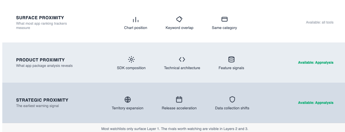
Surface proximity is what most tools measure: same category, overlapping keywords, similar chart position. This is useful but limited. Two apps can share a category and be completely different products targeting different users.
Product proximity is what matters more: similar features, similar SDK composition, similar technical architecture. An app built on the same stack as yours can match your features faster than one built on different technology. An app that has just added the same payments SDK you use is signalling a feature direction. This is the layer most watchlists completely miss.
This is also where Appnalysis does something no App Store ranking tracker does. Most tools compare apps using their App Store listing metadata: the title, subtitle, description, keywords and screenshots. That metadata can be misleading. It can be poorly written, mistranslated, out of date, or deliberately vague. Two apps can have very similar descriptions and be completely different products. Two apps can have different descriptions and be near-identical under the hood.
Appnalysis compares apps using the actual app package: what the app genuinely does, what frameworks it uses, how it is built, what data it accesses. That is not metadata about the app. That is the app. It is the difference between reading a job description and watching someone actually do the work. Two apps that look similar from their App Store listings may be architecturally distant. Two apps that look different may be technically identical. Only app package analysis tells you which is which.
It is worth being clear about what is available at each level. Surface proximity (which apps are similar, what the charts show, who is entering your category) is available on Appnalysis’s free registered tier and covers a significant amount of the workflow described here. Product proximity, specifically SDK composition and binary architecture comparison, requires a paid tier. The Appnalysis pricing page covers what each plan includes (Snapshot, Market View, App Intelligence and Workflow Intelligence) so you can match the depth you need to the right tier before starting.
Strategic proximity is the earliest warning signal: same territory expansion pattern, accelerating release cadence, shifting data collection scope. An app appearing in Germany before it enters the UK is telegraphing its next move. An app that shifted from monthly to weekly releases three months ago is in active product development mode. Combined with product proximity signals, this tells you not just who is competing with you now but who is building toward competing with you in six months.
Appnalysis surfaces all three layers. Most ranking trackers only surface the first.
A Live Example: The UK Finance Top 10
To show how this works in practice, we queried Appnalysis for the current UK iOS finance top 10.
The list as of today:
- HMRC
- Revolut
- Monzo Bank
- Lloyds Mobile Banking
- Klarna
- Trading 212
- Testerup: Test and Earn Rewards
- Hastings Direct Insurance
- PayPal
- Zable Mobile Finance
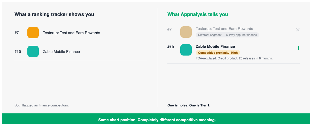
A conventional watchlist built from this chart would add all 10 apps and start tracking them. But Appnalysis immediately reveals something a chart position alone would not: two of these apps require very different responses.
Testerup at position 7 is developed by aestimium GmbH, a German company. It is a survey app that pays users to complete online surveys. It appears in the finance chart because it is categorised under Finance, not because it competes with Monzo or Revolut in any meaningful product sense. It is not a financial services competitor. It is a different business entirely that happens to share a category label.
A conventional ranking tracker would flag Testerup as a top-10 finance app. Appnalysis tells you it is not a competitive threat to a neobank product. The distinction matters because it removes noise from your watchlist and focuses attention on genuine threats.
Zable at position 10 is a completely different story. Appnalysis surfaced the following from a single query: Zable is operated by Lendable Operations Ltd, FCA-regulated, offering credit cards and loans with access to Equifax credit scores. First released on the UK iOS App Store on July 2, 2020, it has released 25 versions since January 2026 alone, roughly one release per week for six months. It carries a 4.86 rating from over 246,000 reviews. It collects Contact Info, Financial Info and Identifiers linked to the user and is directly competitive with Monzo Flex, Monzo’s credit card product.
There is one further signal worth noting. Zable carries a 4+ age rating, the same age rating we documented in our BNPL compliance analysis that automatically engages the ICO Children’s Code for apps collecting financial data. A Monzo product team watching Zable should be aware of this not just as a competitive signal but as a compliance reference point for their own equivalent product.
If you are a product manager at Monzo, Zable at position 10 with a weekly release cadence, 246,000 reviews and a 4.86 rating is not a name to note and revisit. It is a Tier 1 watchlist entry today.
The difference between surface proximity (same category) and product proximity (same specific product features, same regulatory framework, same data collection profile) is the difference between noise and signal.
What to Do Next
The Testerup and Zable example shows how to interpret a chart you already have. The more valuable capability is discovering apps that are not yet in your top 10, specifically ones climbing toward it that you have no reason to watch yet.
For the practical workflow: how to run the new entrant discovery prompts, how to build a three-tier dynamic watchlist, and how to automate the whole process into a weekly competitive intelligence report, see the companion guide: How to Use Appnalysis and Claude to Build a Competitor Watchlist
Go Deeper
- Mobile App Competitor Analysis: A Step-by-Step Guide: the broader framework for turning app intelligence into product and strategy decisions
- Whether you can analyse any mobile app, and why chart position is only one layer of competitive intelligence
- Appnalysis Is a Mobile Intelligence Agent: how Appnalysis connects to Claude and other AI workflows via MCP